Mastering Framer’s Workshop: Build Advanced Components Without Code
Framer’s new Workshop feature unlocks a powerful idea: advanced, logic-powered components — no code required. For freelancers, agencies, and design teams, it means you can now build modals, tabbed content, cookie banners, and scroll-based animations without touching React.
Here’s a quick breakdown of how Workshop works — and how to start using it today.
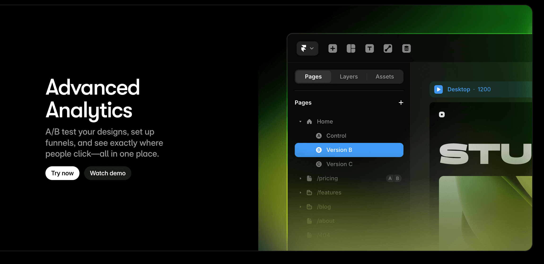
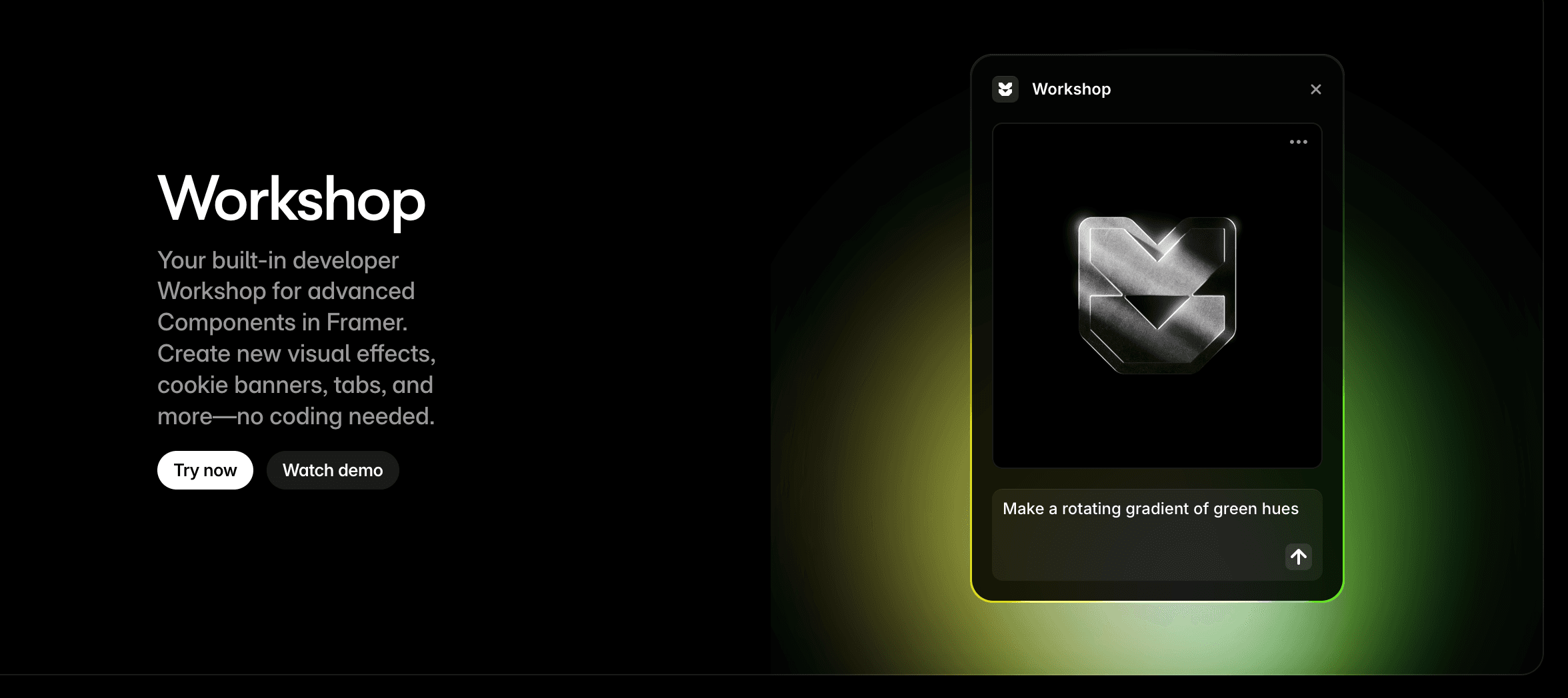
🔧 What Is Workshop?
Workshop is Framer’s built-in interface for creating custom components with interactivity, logic, and props. Think of it as a no-code developer environment for designers.
You can:
Add visual states and interactivity
Set up logic-based behaviors (e.g. toggle visibility, switch tabs)
Create configurable props for reusability
🚀 What You Can Build (No Code Required)
1. Cookie Consent Banners
Show on load, dismiss on scroll or click.
Store preference with built-in state.
💬 Example Prompt:
"Create a bottom-fixed cookie consent banner with a dismiss button. It should show on page load and disappear on click or after 5 seconds of scroll. Store user preference using local state."
2. Tabs with Content Switching
Click to toggle content panels.
Use props to manage tab titles and active styles.
💬 Example Prompt:
"Build a tabbed section with three tabs: 'Overview', 'Features', and 'Pricing'. Clicking each tab reveals different content below, with an active state indicator. Make the tab titles editable with props."
3. Scroll-Based Animations
Trigger fade-ins or parallax as users scroll.
No custom code or libraries needed.
💬 Example Prompt:
"Add scroll-triggered fade-in animations to three stacked sections. Each section should appear as it enters the viewport. Use Workshop to control animation timing and direction."
4. Custom Modals
Reusable across pages.
Control open/close state with props and triggers.
💬 Example Prompt:
"Create a reusable modal component that opens on button click and closes on background click or ESC key. Include props for modal title, content, and open state."
5. Interactive Feature Grids
Reveal content on hover or tap.
Bind to CMS collections for scalability.
💬 Example Prompt:
"Design a grid of feature cards that reveal extra details on hover or tap. Each card should pull content dynamically from a CMS collection and include an icon, title, and hidden description."
🛠️ How It Works (In 60 Seconds)
Launch the Workshop by opening the Plugins panel in Framer (bottom-left of the editor), then click “Workshop”.
Create a component from layers or sections.
Use the Props panel to define editable inputs (text, toggles, colors, etc.).
Add logic or triggers — e.g. “On Click → Set State”.
Use variants for visual or behavioral states.
Drag and drop it into any page, just like a native component.
✅ Why It Matters
For freelancers and agencies:
Build once, reuse across projects
Speed up delivery with interactive UI blocks
Reduce dev handoff or dependency
Offer custom branded components with editable settings
⚠️ When You Still Need Code
Framer Workshop doesn’t yet support:
API calls
Advanced form validation
Deep data manipulation
For those, you’ll still use code components (React) — but Workshop handles 90% of what most client projects need.
📎 Final Thought
Framer’s Workshop bridges the gap between design and front-end logic. It empowers designers to build functional, reusable components visually — and that’s a game-changer for professional workflows.
🔗 Explore More
Coming soon: Free Workshop Component Pack (modals, tabs, banners)
Subscribe for more no-code tutorials & Framer updates